Building Energy Dashboard - an end-to-end Data Science project
I’m an architect and have been designing buildings for over 10 years now. In face of all the environmental challenges that we’ve been going through on our planet, one of the key responsibilities in the AEC (architecture, engineering and construction) field is to create more sustainable buildings and make them more efficient in energy consumption. As a designer, there is a set of concepts that we use to achieve that, like solar path study and passive design strategies. However, most of the time this work is done empirically, with no data collected after the building is completed. The idea of a more data-driven approach led me to start learning Data Science, which has great usage for sustainability and energy efficiency in buildings.
Nowadays, there are great technology available to measure lots of information about buildings. This project tries to achieve an example of how Data Science can be used in the AEC field, by helping to monitor the building’s data and using weather forecast data to help predict the building’s energy consumption. With that knowledge, the building operators are able to make decisions and create strategies to improve how the energy is used in that building and make it more efficient.
This was my first attempt to create a project with so many different steps and tools to use. I learned a lot from it and this post is a way to explain my process. Please keep in mind this is not a step-by-step tutorial, but if you have any questions and would like a more in-depth explanation about any part of it, feel free to contact me.
Take a look at the project final result , or you can check out the code behind this project
The page may take a while to open due to Render.com free plan limitations.
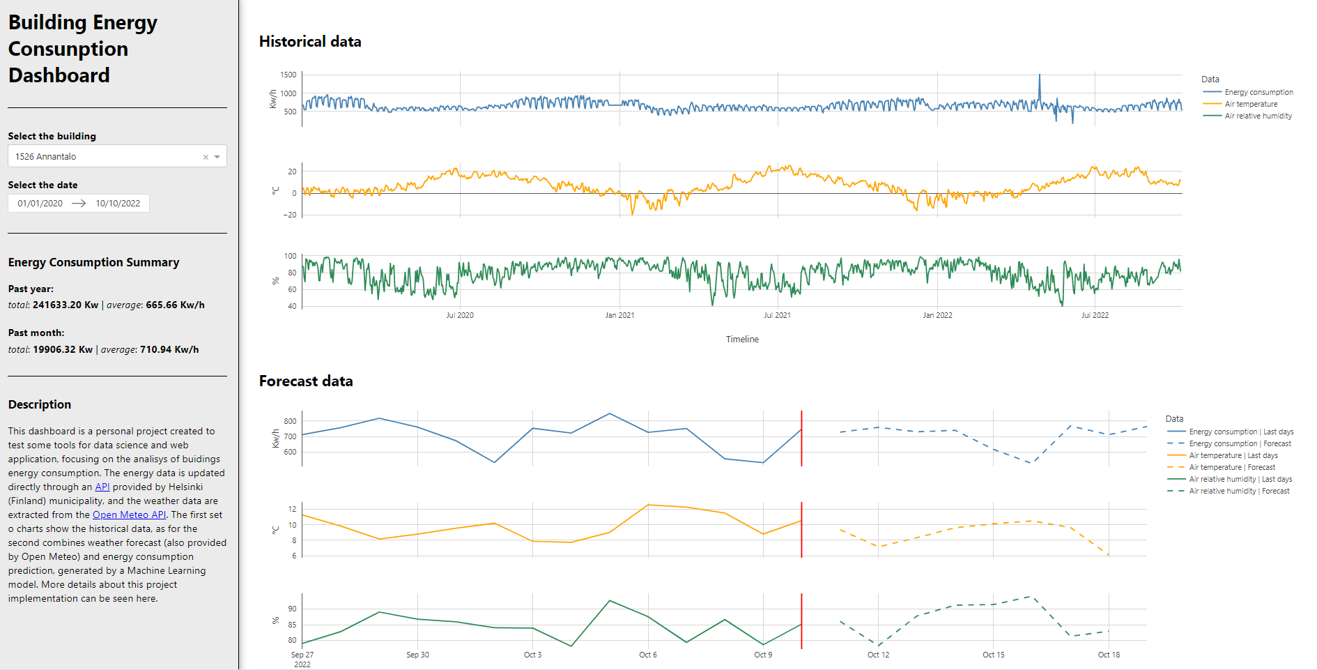
print screen of the dashboard page
The data
For this project I wanted to work with real-world and streamed data, so that the app would be updated constantly. After searching for some options, I chose to work with the API provided by the Helsinki municipality , because it was open and updated daily. In addition, I needed weather data to work as covariates for the energy consumption prediction. The Open Meteo API was chosen basically for the same reasons: openness and ease of use.
Once that was established, I used the Requests Python library to connect the data to my dashboard. This was my first time using data from an API, but it was easier than I imagined at first. The toughest part was to understand how the data was structured and how to work with the JSON format. I had to go back and forth between JSON and Pandas Dataframe. After some trial and error, I got the hang of it, and soon I had all the data prepared the way I needed for the charts.
Dash and Plotly
There are a few frameworks to create dashboards using Python, but I chose Dash because it was one of the most popular and I could find a lot of resources to learn it on my own. I got started with a few tutorials, but the documentation was also very helpful. In fact, one of the great benefits of this project to me was that I felt that I could really learn from the official documentations. I knew that reading the docs was a great resource, but it wasn’t easy when I was a beginner. So it felt great to be able to break this barrier and give a step forward in my skill set.
I started with a simple implementation of the Dash app, with a single Plotly chart. After that, I created the first interaction, with a date picker that would control the timeline of the chart. With that, I had all the basics working, the next steps would be to add more data and the other charts.
This project was also a great opportunity to work with HTML and CSS. Although web development is not my main goal, it was important to know the basics in order to have more control of how the web app was structured and how it would look like. I didn’t want to have a standard template, so I tweaked the CSS a little to get a more customized look.
Another step worth mentioning is that I saw a great video by @arjan_codes when I was in the middle of this process. In his videos he creates a Dash app, but most of the Dash part I already knew. What I liked the most was that he implemented some concepts of software design that helped me understand a better way to structure my code and to make it more manageable in the long run. This was not on my list of things to learn, but since I was working on this project, it was an opportunity to exercise that.
After working on the dashboard for a while, I had done almost everything that was needed: structure, appearence and all the charts. The only thing missing was the data from the energy consumption forecast. So, it was time to focus on Machine Learning.
ML Training
My process of learning Data Science has been very diffuse, because I come from another background, which is architecture. I started to learn DS when I learned Python, first as curiosity and not knowing exactly how I was going to use it. The more I dove into it, the more I liked it. Then, I started to see a few ways I could use it in the AEC field. The reason I mention this is to say that I first learned the basics of ML in a practical way. Mainly, the process of preparing, splitting, training data and evaluating the model in a Jupyter notebook. But in my project I had to deal with time series data, which has some particularities. Seasonality, stationarity, trend, are concepts that I had to understand, and there was a lot of different approaches to time series ML. So I took a step back to learn more about the concepts underlying the models and algorithms in ML. This is a very wide topic and I couldn’t cover most of it, but it certainly helped me to be more aware of how ML models work.
While I was researching, I came across the Darts Python library that has a unifying approach towards time series. It was very helpful to have everything in one library and to have a tool specific for this task. This was another point where the docs helped me a lot. It was challenging, but I managed to finally get some good results.
You can take a look at this notebook to get the details about the model training. I know there are things that can be done to improve the model - like better handling the outliers, creating lag features, testing and fine-tuning other type of models -, but for this project I felt that I was already in a good place. I saved the model and incorporated it in my project folder.
At first, it was easy to connect the model to my app data and create the last piece of the chart, which was the prediction for energy consumption. However, the model was a very heavy file - even though later I managed to reduce it with Bz2file - that created a problem with GitHub limitations once I tried to push it into production. I knew there was a better way to handle this, but I felt it was way out of my league. Since I had no other option, I started to learn a little bit about MLOps.
ML for production
At this stage, I knew that I had to improve my learning process, so I decided to take more structure courses rather than grabing knowledge from diffuse sources. I started a course in MLOps in Alura which helped me a lot to understand the fundamentals and gave me the confidence to try this approach in my projects.
In the course, I learned to work with Flask, but I decided to try working with FastAPI , since it has been growing in preference in the ML community. It was also a great way to challenge myself. The idea was that, instead of having the ML model file inside my dashboard project, I would put it in another repository and create an API that would be able to connect with the dashboard app. That way I could have all the things related to the model in a separate structure, making it easier to maintain and update when necessary.
Once the API was done, I created a Docker file and an image in my local PC to set everything up to deploy. This part was tricky, but once I understood how uvicorn (and gunicorn) works, I was able to succeed. Now, there was only one step missing, which was to deploy everything, so that I could make it easily accessible online.
App deploy
As I was working on this project, Heroku (which is one of the most popular options) ended all free plans, so I had to look for other options. I saw someone in the Dash community recommending
Render.com
and I needed a free plan since this was a portfolio project and was my first attempt to do this. First I deployed the dashboard. For this, Render has the option to create a Python environment during the build process, so all you really need is a requirements.txt file with all the libraries that pip has to install. I failed a few times because of some necessary configuration and because I hadn’t properly set my code to invoke gunicorn, but once I figured this out it was very straightforward. One of the downsides of using the free plan is that the build process is slow, so, trying, debugging and fixing took more than I expected.
After that, I started the deploying process for the API. For that, I used the Dockerfile, which is very easy to use in Render also. So right now I have two web services in Render, one for the ML API and the other for the dashboard. The dash application requests the data from the ML API, giving as an input the building energy consumption (from the selected building) and the weather forecast data (for the model to use as covariates for the prediction). The dashboard receives the prediction data and then transforms this data to show as the blue dashed line on the prediction dashboard. Everything was finally working!
Final thoughts
My goal with this post was to show the process, of someone who is finding his way into a new field, coming from architecture to data science. I have been studying python, data science and machine learning for a few months now, but this project helped me to elevate my skills in a whole new way. The idea was to create a project that would give me the ability to learn a full process, coming from the data collection all the way to deploying an app, but, at the time, I didn’t have the complete understanding of all the things I would have to do and learn. I had to solve the problems as I moved forward in the project.
I also think that my background in architecture helped me a lot. Firstly, because of a generalist approach: we have to study physics, structure, materials, in conjunction with, social studies, psychology, design, history, art, aesthetics, and so on. We are used to seeing the whole process that involves a building, from the urban perspective narrowing down to the individual user. This led me to try a data science project where I could see the whole picture, and get to know a little about each step of the process. Secondly, architectural design has a lot to do with problem-solving. You have goals and a briefing when you start a project, but the process is not linear, and you have to constantly adapt to new circumstances that appear as you develop. It felt similar to do this in a data science project, where you have to plan carefully before starting, but you also have to be able to face new problems and get the job done.
If you read all the way here, I hope this was helpful in any way. Please contact me if you have any questions. I would also appreciate feedback on ideas to improve the code, the dashboard or the ML model. Thanks a lot!